
Access Restricted for EU Residents
You are attempting to access a website operated by an entity not regulated in the EU. Products and services on this website do not comply with EU laws or ESMA investor-protection standards.
As an EU resident, you cannot proceed to the offshore website.
Please continue on the EU-regulated website to ensure full regulatory protection.
Monday Nov 24 2025 10:14

17 min

CFD trading tutorials: Venturing into the world of Contracts for Difference (CFD) trading can be an exciting journey.
CFD Trading Basics: It offers a flexible way to speculate on the price movements of various financial markets, including stocks, forex, commodities, and indices. At the heart of any successful trading strategy lies the ability to analyze market data, and the primary tool for this analysis is the trading chart. Charts are the language of the market, translating complex price data into a visual format that traders can interpret to make informed decisions.
Understanding how to read these charts is not just a helpful skill; it is a fundamental requirement. This guide will walk you through the most common types of trading charts, explain their components, and teach you how to interpret the stories they tell about market behavior. Whether you are just starting or looking to refine your analytical skills, mastering chart reading is your first major step toward navigating the markets with confidence.
At its core, a trading chart is a graphical representation of an asset's price over a specific period. It plots price data on a vertical axis and time on a horizontal axis. This simple visualization allows traders to see historical performance, identify patterns, spot trends, and forecast potential future movements. Without charts, traders would be staring at a sea of numbers, making it nearly impossible to discern meaningful information about market sentiment and price action.
Every chart displays four key pieces of price data for a given time frame:
The time frame you choose can range from one minute (for day traders) to one week or one month (for long-term investors). The combination of these data points, visualized across different chart types, forms the basis of technical analysis.
While there are many ways to visualize price data, three chart types have become the standard for most traders. Each offers a different level of detail and visual clarity.
1. The Line Chart

The line chart is the simplest and most basic type of trading chart. It is created by connecting a series of data points with a line. Typically, these data points represent the closing price of an asset for each period within the specified time frame. For example, on a daily chart, the line would connect the closing price of each day.
How to Read a Line Chart:
Reading a line chart is straightforward. The upward or downward slope of the line indicates the general price trend. If the line is moving up, it signifies an uptrend (prices are generally increasing). If it is moving down, it signifies a downtrend (prices are generally decreasing).
Advantages:
Simplicity: Line charts offer a clean, uncluttered view of price movement, making it easy to spot the overall trend and identify major support and resistance levels.
Clarity: By filtering out the "noise" of intraday price fluctuations (the high and low), line charts provide a clear picture of the general market direction.
Disadvantages:
Lack of Detail: The primary drawback of a line chart is its simplicity. It only shows the closing price, ignoring the opening, high, and low prices for the period. This means traders miss out on valuable information about price volatility and market sentiment within each period. For instance, you cannot tell if a day was highly volatile with a large price range or quiet with a small range.
Line charts are best used for getting a quick overview of long-term trends or when presenting price history in a simple, easy-to-understand format. However, for detailed analysis, most traders prefer more informative chart types.
2. The Bar Chart
The bar chart, also known as an OHLC chart (Open, High, Low, Close), provides significantly more information than a line chart. Each period on the chart is represented by a single vertical bar.
Components of a Bar:
The Vertical Line: The entire length of the bar represents the trading range for the period. The top of the bar is the high price, and the bottom is the low price.
The Left Tick (or Dash): A small horizontal line extending to the left of the vertical bar indicates the opening price.
The Right Tick (or Dash): A small horizontal line extending to the right of the vertical bar indicates the closing price.
How to Read a Bar Chart:
By examining a bar, a trader can quickly understand the price action for that period.
If the right tick (close) is higher than the left tick (open), it was a bullish period where the price increased. These are often colored green or black.
If the right tick (close) is lower than the left tick (open), it was a bearish period where the price decreased. These are often colored red.
The height of the bar indicates the volatility. A long bar signifies a large price range and high volatility, while a short bar indicates a small price range and low volatility.
Advantages:
Comprehensive Data: Bar charts provide all four key data points (open, high, low, close), giving a full picture of the trading activity for each period.
Volatility Analysis: The length of the bars makes it easy to spot periods of high and low volatility.
Disadvantages:
Visual Complexity: For beginners, bar charts can look more cluttered and less intuitive than line charts. The mix of vertical lines and horizontal ticks can be visually busy, making it slightly harder to see the overall trend at a glance.
Bar charts are a favorite among many Western traders who value the detailed information they provide for conducting in-depth technical analysis.
3. The Candlestick Chart
The candlestick chart is arguably the most popular type of chart among modern traders. Originating from Japan in the 18th century, it displays the same OHLC information as a bar chart but in a more visually intuitive and appealing way.
Components of a Candlestick:
Each candlestick consists of a "real body" and "wicks" (also called shadows or tails).
The Real Body: This is the thick part of the candlestick. It represents the range between the opening and closing prices.
The Wicks (Shadows): These are the thin lines extending above and below the real body. The upper wick shows the high price for the period, and the lower wick shows the low price.
The color of the real body tells you about the price direction:
A Green (or White/Hollow) Body: Indicates that the closing price was higher than the opening price. This is a bullish candle.
A Red (or Black/Filled) Body: Indicates that the closing price was lower than the opening price. This is a bearish candle.
How to Read a Candlestick Chart:
Candlestick charts provide a wealth of information about market sentiment.
Long Real Bodies: Suggest strong buying (green) or selling (red) pressure.
Short Real Bodies: Suggest little price movement and indecision in the market.
Long Upper Wicks: Imply that buyers tried to push the price up, but sellers took control and pushed it back down before the period closed. This can be a bearish signal.
Long Lower Wicks: Imply that sellers tried to push the price down, but buyers stepped in and drove it back up. This can be a bullish signal.
Candlestick Patterns:
One of the biggest advantages of candlestick charts is that groups of candlesticks form patterns that can signal potential reversals or continuations of a trend. Patterns like the Doji, Hammer, Engulfing Pattern, and Morning Star provide powerful visual cues about market psychology. For example, a "Hammer" pattern, which has a short body and a long lower wick, often appears at the bottom of a downtrend and can signal a potential bullish reversal.
Advantages:
Visually Intuitive: The color-coded bodies make it easy to instantly see whether a period was bullish or bearish.
Reveals Market Psychology: The shape and size of the body and wicks provide deep insights into the battle between buyers and sellers.
Identifiable Patterns: Recognizable patterns offer predictive value, helping traders anticipate future price movements.
Disadvantages:
Can Be Misleading: Like any indicator, individual candlestick patterns are not foolproof and should be used in conjunction with other analysis tools. A pattern in one time frame might be contradicted by the larger trend in another.
Now that you understand the different chart types, the next step is to learn how to analyze them to make trading decisions. This involves identifying trends, support and resistance levels, and using technical indicators.
1. Identifying the Trend
The trend is the general direction in which an asset's price is moving. Trading with the trend is a core principle for many successful traders. There are three types of trends:
Uptrend (Bullish Trend): Characterized by a series of "higher highs" and "higher lows." The price is consistently reaching new peaks and the pullbacks are not falling below previous lows. You can draw a "trendline" by connecting the rising lows to visualize the uptrend.

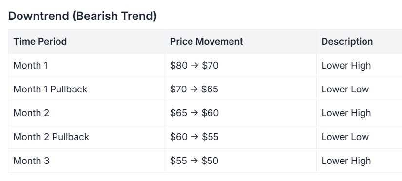
Downtrend (Bearish Trend): Characterized by a series of "lower highs" and "lower lows." The price is consistently falling to new troughs, and the rallies are not exceeding previous highs. A trendline can be drawn by connecting the falling highs.
Sideways Trend (Ranging Market): Occurs when the price moves back and forth between a relatively stable high and low, without a clear upward or downward direction. This indicates a period of consolidation or indecision.
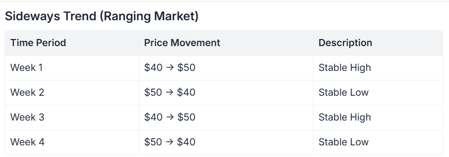
Identifying the primary trend is crucial. In an uptrend, traders typically look for opportunities to buy. In a downtrend, they look for opportunities to sell (or short).
2. Support and Resistance Levels
Support and resistance are foundational concepts in technical analysis.
Support: A price level where a downtrend is expected to pause due to a concentration of demand or buying interest. As the price drops to the support level, it is likely to bounce back up. A support level is where buyers tend to step in.
Resistance: A price level where an uptrend is expected to pause due to a concentration of supply or selling interest. As the price rises to the resistance level, it is likely to fall back down. A resistance level is where sellers tend to emerge.
You can identify these levels by looking for historical price points where the market has repeatedly reversed direction. On a chart, these often appear as horizontal lines connecting previous peaks (resistance) or troughs (support). When a price breaks through a resistance level, that level may become a new support level. Conversely, if a price breaks below a support level, that level may become a new resistance.
3. Using Volume
Volume refers to the number of units of an asset traded during a specific period. It is usually displayed as a bar graph at the bottom of the price chart. Volume is a critical indicator because it confirms the strength of a price movement.
High Volume on a Price Increase: Confirms strong buying interest and suggests the uptrend is healthy and likely to continue.
High Volume on a Price Decrease: Confirms strong selling pressure and suggests the downtrend is strong.
Low Volume on a Price Movement: May indicate a lack of conviction behind the move, making it more likely to reverse. For example, if a price breaks through a key resistance level but on very low volume, it could be a "false breakout."
Always pay attention to volume. A price move accompanied by high volume is far more significant than one without it.

4. Incorporating Technical Indicators
Technical indicators are mathematical calculations based on price, volume, or open interest of a security or contract. They are plotted on the chart to help traders forecast price movements. There are hundreds of indicators, but they generally fall into a few categories.
Trend-Following Indicators (e.g., Moving Averages): These help confirm the direction and strength of a trend. A Moving Average (MA) smooths out price data to create a single flowing line. A "50-day MA," for example, shows the average closing price over the last 50 days. When the price is above the MA, it's generally considered a bullish signal, and when it's below, it's bearish. Traders often use two MAs (e.g., a 50-day and a 200-day) and look for "crossovers." A "golden cross" (short-term MA crosses above long-term MA) is a bullish signal, while a "death cross" (short-term MA crosses below long-term MA) is bearish.

Momentum Indicators (e.g., Relative Strength Index - RSI): These indicators, often called oscillators, help identify "overbought" or "oversold" conditions. The RSI oscillates between 0 and 100. A reading above 70 is typically considered overbought (the asset may be due for a pullback), while a reading below 30 is considered oversold (the asset may be due for a rally).
It's important not to clutter your chart with too many indicators. Choose two or three that complement each other and that you understand well. For instance, you might use moving averages to identify the trend and RSI to time your entries and exits within that trend.
Learning to read trading charts is a journey, not a destination. It combines science and art, requiring both an understanding of technical principles and an intuitive feel for market dynamics.
Start by mastering the basics. Get comfortable with candlestick charts, as they offer the most comprehensive view of price action and market sentiment. Practice identifying trends, drawing support and resistance lines, and observing volume. Then, slowly introduce one or two technical indicators to supplement your analysis.
Remember that no chart or indicator can predict the future with 100% certainty. The goal of chart analysis is not to be right every time but to put the probabilities in your favor. By using charts to understand historical context, identify current market structure, and anticipate potential scenarios, you can build a robust framework for making disciplined and well-reasoned CFD trading decisions. As with any skill, consistent practice and continuous learning are the keys to proficiency.
Looking to trade CFDs? Choose Markets.com for a user-friendly platform, competitive spreads, and a wide range of assets. Take control of your trading journey today! Sign up now and unlock the tools and resources you need to succeed in the exciting world of CFDs. Start trading!
Risk Warning: This article is provided for informational purposes only and does not constitute investment advice, investment research, or a recommendation to trade. The views expressed are those of the author and do not necessarily reflect the position of Markets.com. When considering shares, indices, forex (foreign exchange), and commodities for trading and price predictions, remember that trading CFDs involves a significant degree of risk and may not be suitable for all investors. Leveraged products can result in capital loss. Past performance is not indicative of future results. Before trading, ensure you fully understand the risks involved and consider your investment objectives and level of experience. Cryptocurrency CFD trading restrictions may apply depending on jurisdiction.